Charting REST API Data in a Dashboard
Within a couple of minutes you'll learn how to request data from a REST endpoint and build a chart to display data points
There are many different ways to get data for a Node-RED dashboard. One common way is to use a REST API.
A REST API is a set of web services that allow developers to interact with a server and its resources. To get data from a REST API, you can use the HTTP nodes in Node-RED to send HTTP requests to the API and receive the data in the response. In this post we'll guide you through the process.
First, let's consider what data we want to get. For a dashboard chart it's nice if there were at least two dimensions to it. For this guide we'll create a chart of the number of downloads for a certain NPM package.
# Getting some data
Reading the data for a package is done through a HTTP GET request, for example:
https://api.npmjs.org/downloads/range/last-month/@flowforge/node-red-dashboard.
A simple flow to achieve this would be:
Where we paste the URL from above into the settings panel:

When running this flow you'll see a blob of text in the Debug pane. This is a great first start, but a blob isn't useful for the rest of the flow.
We need to parse the data as JSON. While the JSON node
would work, the HTTP request node can do this natively. Let a parsed JSON object
the Return settings of the HTTP request node.
So now we got the data, and a little more than we need, so let's change the message output to keep only what we're interested in; payload.downloads. To do this, we'll use the change node.

# Building the Dashboard
Follow the Dashboard getting started guide to get up and running.
Now we drag in the chart node that's available after installing the dashboard package and make sure it' input comes from the configured change node. Before hitting the deploy button the dashboard itself needs configuring:
First add configuration for the ui-group: 
To setup the ui-group correctly you'll need to add configuration for the ui-page: 
To create the UI page it requires another 2 config settings, ui-base, and the theming through ui-theme.
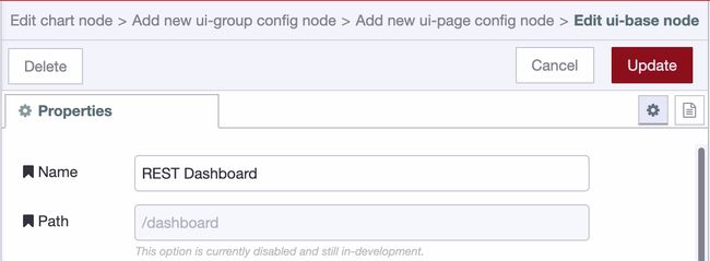
The default theme is great, so just accept that, and save all dialogs to continue the chart creation.
# Normalizing the data
The data for the chart needs to be changed before we can show it. The messages should have a x and y key. So let's prepare the data with a combination of the Split and change node.
The Split node with the default configuration allows to 30 elements of the array to be mapped individually. The change node will set the payload.x and payload.y
on the message:

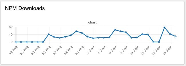
Connect the change node output to a new chart node, and voila:
# Keeping the data up-to-date
While we created a chart and it has some data, there's one more thing to explain. How can the data be kept up-to-date? It's straight forward to have the Inject
node run every night, but the chart would now have multiple data points for the same day. This paints multiple lines on top of each other. While that works, the hover of the chart will display the duplication and it's wastefull.
So before we update the chart we need to send a message to the chart where the
payload is []. That way the chart is emptied first, and right afterwards it will receive the new data to write.
Written By:
Published on:
Related Articles:
- Custom Vuetify components for Dashboard 2.0
- Node-RED Tips - Dashboard Edition
- Persisting chart data in Node-RED Dashboards